The short version
- 01The best lead capture form is proportional: a newsletter may ask only for email, while a quote can justify qualifying details.
- 02Examples should be copied as systems: offer, placement, fields, trigger and follow-up, not as visual layouts alone.
- 03Multi-step flows help organize necessary complexity, but splitting an already simple form adds needless navigation.
- 04Measure qualified outcomes and step-level abandonment, not only raw form submissions.
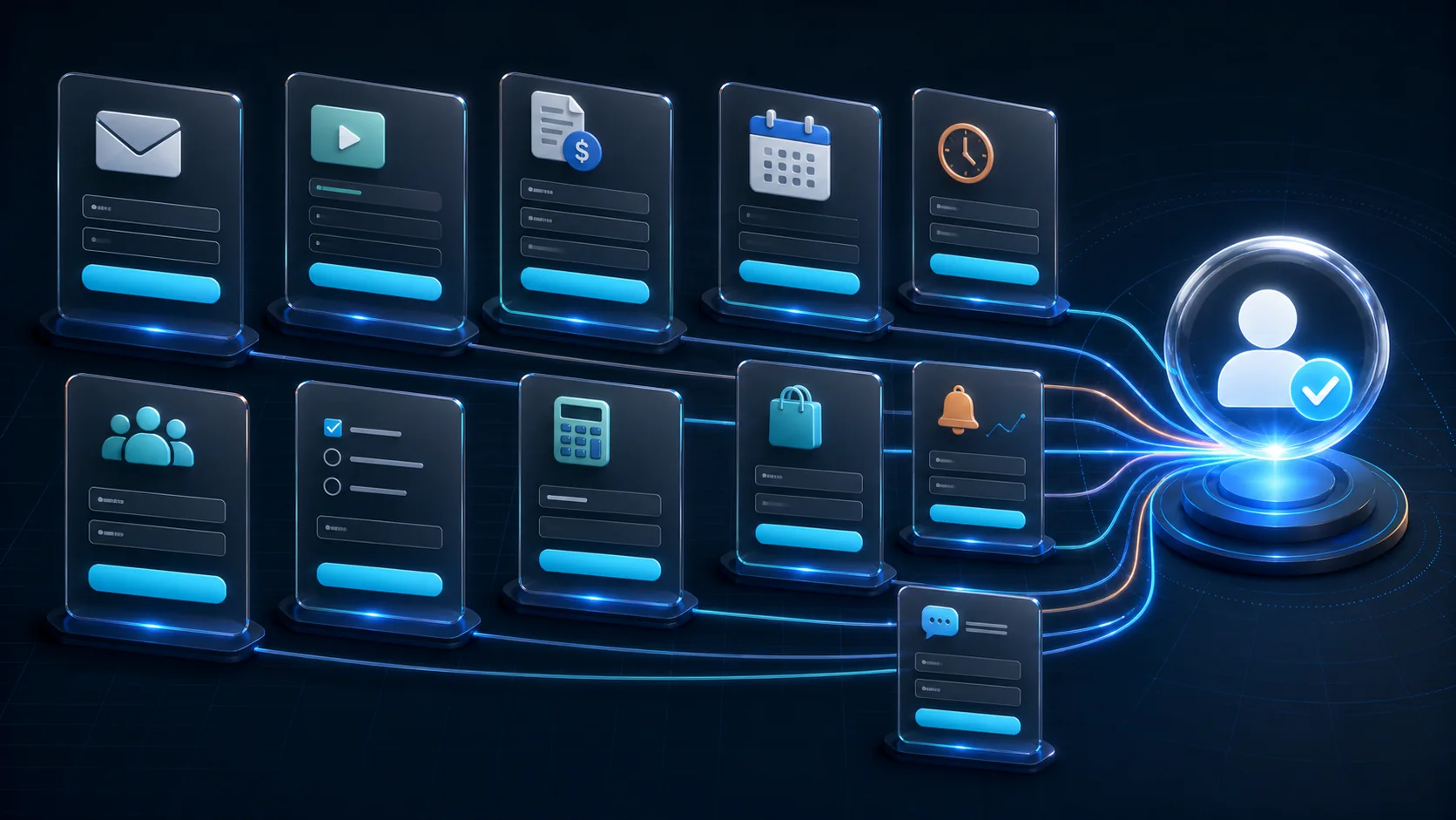
A lead capture form exchanges a useful next step, such as a resource, recommendation, quote, trial, alert, or demo, for contact information and any qualification data required to deliver that next step well. The best lead capture form examples match the offer, fields, placement, trigger, and follow-up to intent already visible on the page.
This is not a gallery of attractive rectangles. Each of the 25 examples below is a reusable campaign system. You will see where it belongs, what it should promise, which fields are defensible, when it should appear, what happens after submission, and which metric reveals whether it attracts valuable leads rather than empty volume.
If your form needs more than a few related fields, compare multi-step and single-step forms before choosing the layout. If you are still choosing software, the best popup builders comparison maps tools to campaign types and pricing models. You can also paste your website into the free AI popup generator to see three brand-matched directions without creating an account. For layout, mobile, consent, and accessibility guidance that applies to any of these patterns, see popup design best practices.
Lead capture form examples at a glance
| Example | Funnel stage | Sensible first version | Best placement or trigger | Primary success metric |
|---|---|---|---|---|
| 1. Topic newsletter | Awareness | Email + topic | After article engagement | Confirmed engaged subscriber |
| 2. Content upgrade | Awareness | Inline or scroll depth | Resource use and next action | |
| 3. Email course | Awareness | Email + optional goal | Article end | Course completion |
| 4. Webinar registration | Awareness/Mid | Name, work email, role | Landing page | Attendance and qualified follow-up |
| 5. Waitlist | Awareness/Mid | Email + use case | Product/launch page | Activated launch user |
| 6. Template library | Mid | Email + role | Feature/content page | Template activation |
| 7. Calculator result | Mid | Inputs, then email | Embedded tool | Result-to-opportunity rate |
| 8. Assessment | Mid | 3-7 answers, email | Embedded or popup | Qualified completed assessment |
| 9. Product finder | Mid | Preferences, email optional | Category page | Recommendation click/purchase |
| 10. Comparison email | Mid | Comparison page/exit | Return visit or assisted purchase | |
| 11. Demo request | Bottom | Work email, company, goal | Pricing/feature page | Held qualified demo |
| 12. Contact sales | Bottom | Contact + routing detail | Enterprise page | Sales-accepted lead |
| 13. Quote request | Bottom | Project details + contact | Service page | Quote-to-sale rate |
| 14. Consultation | Bottom | Goal, timing, contact | High-intent page | Attended consultation |
| 15. Free trial | Bottom | Minimum account details | Product CTA | Activated account |
| 16. First-order offer | Ecommerce | Email or SMS | Delayed/engaged visit | Redeemed profitable order |
| 17. Back-in-stock alert | Ecommerce | Email/SMS + variant | Product page | Alert-driven purchase |
| 18. Price-drop alert | Ecommerce | Email + product | Product page | Alert-driven margin |
| 19. Cart save | Ecommerce | Exit from cart | Recovered order | |
| 20. Size/fit help | Ecommerce | Category answers + email | Product/category page | Lower returns + purchase |
| 21. Shipping threshold | Ecommerce | Email only if needed | Cart state | Incremental completed order |
| 22. Event lead scan follow-up | Contextual | Email + interest | QR landing page | Post-event meeting |
| 23. Referral invite | Customer | Friend email or share link | Success/account page | Activated referral |
| 24. Customer research recruit | Customer | Email + segment question | Logged-in/product message | Completed interview |
| 25. Exit survey with follow-up | Any | One reason + optional email | Exit intent | Actionable reason + recovered lead |
The field suggestions are starting hypotheses, not universal rules. A high-value enterprise demo may require company context before routing; a creator newsletter may need only email. The governing question is: does this answer change delivery, qualification, personalization, or the next conversation? If not, remove the field or collect it later.
What makes a lead capture form effective?
An effective form has five connected layers.
Value: The visitor understands what they receive, how soon, in what format, and why it matters. “Submit” describes database behavior; “Get the comparison” describes value.
Message match: The offer continues the page. An exit form on a pricing page may offer plan help; an article about onboarding may offer an onboarding checklist. A generic sitewide ebook often loses to a modest page-specific resource because the relevance is obvious.
Proportionate effort: The information request fits the value and commitment. One email for a checklist is reasonable. Ten business questions for a one-page PDF are not. A quote can justify additional details because they change the estimate.
Usable interaction: Labels remain visible, keyboard order is logical, required and optional states are clear, errors explain how to recover, and success feedback confirms what happened. The W3C forms tutorial provides implementation guidance; its notification section specifically recommends concise textual errors and correction instructions.
Reliable follow-up: The form sends clean data to an owned system, triggers the promised response, records consent where needed, and gives a human team enough context. A high completion rate cannot compensate for leads lost in an integration or receiving an irrelevant sequence.
1-5: Audience and content lead capture forms
1. Topic-specific newsletter form
Replace “Join our newsletter” with a concrete editorial promise: topic, format, and cadence. Example: “Get one practical conversion teardown every Thursday.” Ask for email, and add a topic choice only if the site publishes genuinely different streams and will honor the preference. For twenty more email-first patterns with their headline formulas and triggers, see the email popup examples.
Place the form after meaningful engagement: near the end of a strong article, after a relevant section, or on a repeat visit. Send an immediate confirmation explaining what will arrive next. Measure confirmed subscribers who open or click the promised topic, not raw form submits. A list filled with people who expected a download but receive a broad newsletter is not healthy growth.
2. Article content-upgrade form
Turn the work implied by the article into a portable resource: a checklist, worksheet, template, script, decision tree, or spreadsheet. The resource should save the reader from copying the post into their own notes. The headline can name the exact artifact: “Take the 30-point launch checklist with you.”
Use one email field unless personalization is central. Place an inline form after the relevant method and a restrained scroll-triggered invitation later. Follow with the file or access link immediately, then send content that helps apply it. Measure resource access, the next relevant action, and unsubscribe behavior.
3. Short email-course form
An email course works when the outcome needs a sequence rather than a PDF. State the number of lessons, cadence, workload, and finish line: “Five 10-minute lessons to build your first lead capture flow.” Ask for email and, optionally, one goal that changes examples inside the sequence.
Avoid calling an ordinary promotional nurture an “email course.” Each lesson must deliver the promised progress before a sales ask. Place the form at the end of a pillar guide or on a focused landing page. Measure lesson engagement, completion, replies, and the product action that naturally follows the course.
4. Webinar or workshop registration
A webinar form often needs name, email, and one role or use-case question. Ask company only if it changes routing or examples. Show date, time zone, duration, speakers, learning outcomes, recording policy, and what registrants receive. Calendar insertion and reminder consent should be clear.
The success page should confirm registration and provide calendar options. The follow-up should distinguish attendance, no-show, and replay behavior. Measure attendance and qualified actions after the event rather than registration volume alone. A giveaway can inflate signups while reducing the proportion of participants who need the subject.
5. Product-launch waitlist
Explain what membership means. “Join the waitlist” is incomplete without expected access sequence, member benefit, and communication cadence. An early SaaS can ask email plus intended use; a consumer launch may ask only email or SMS. Do not collect extensive demographic data before the product demonstrates value.
Use the first-party answer to prioritize interviews and onboarding, not merely to decorate an announcement. Send confirmation, set expectations honestly, and keep the list updated when the timeline changes. Measure activation after invitation, not the size of the prelaunch database. See the SaaS product-launch solution for campaign context.
6-10: Interactive and consideration-stage forms
6. Template or swipe-file library
Offer a set of working files tied to the current job: popup copy patterns, proposal templates, onboarding emails, or design briefs. Show previews and formats before asking for contact information. Email plus role can personalize which template appears first, but do not request company size unless the library changes materially by segment.
The follow-up should explain where to start and link directly to the files. Measure actual template use, return visits, and product activation. A 100-template archive can feel less valuable than five carefully annotated examples; curation and instructions are part of the offer.
7. Calculator result form
Let the visitor provide problem inputs before requesting contact. A savings, pricing, capacity, ROI, or conversion calculator should display meaningful preliminary value without using the email as a ransom gate. If the detailed report requires delivery, explain what the emailed version adds.
The form may ask email plus one routing field after the calculation. Store the inputs with the lead so follow-up refers to the scenario, but do not imply precision beyond the model. State assumptions and limitations. Measure completed calculations, report delivery, qualified conversations, and whether the estimate predicted a valuable use case.
8. Diagnostic assessment
An assessment turns several answers into a score, maturity stage, risk profile, or prioritized recommendation. Start with an easy question connected to the promised result, group the rest logically, show progress, and explain the scoring basis. Ask for email before the full report only when delivery adds real value.
A multi-step flow is often appropriate because the questions form stages and may branch. The W3C multi-page form guidance recommends indicating progress and grouping controls logically. Measure completed assessments, qualified segments, and follow-up use, not how many people click step one.
9. Product-finder quiz
Ask preference questions that genuinely narrow options: use case, constraints, size, style, experience, or budget band. Avoid asking information already observable from the current product or category page. Show a useful recommendation before making contact mandatory when possible; offer email to save results, price alerts, or a personalized routine.
This form can reduce decision friction without a discount. Measure recommendation clicks, add-to-cart, purchase, returns, and list engagement by declared preference. If every answer leads to the same bestseller, the interaction is theater rather than personalization.
10. “Email this comparison” form
On a long comparison, allow the visitor to receive the table, shortlist, or saved configuration. Email is usually sufficient. If the comparison supports multiple roles, one preference can tailor the summary. Trigger near the table, at the end, or on exit after substantial engagement, not immediately on arrival.
The email should contain the promised comparison and a stable link, then invite a next step appropriate to readiness. Measure return visits, plan evaluation, assisted purchase, and unsubscribe. This pattern is especially useful on software and high-consideration product pages.
11-15: High-intent SaaS and service forms
11. Demo request form
The form must tell prospects what kind of demo they will receive, how long it takes, who should attend, and whether scheduling is immediate. Start with work email and the one or two questions that change routing or preparation: use case, team size, existing tool, or goal. Avoid asking the sales representative's entire discovery checklist online.
A multi-step version can begin with the goal, then collect contact details, then schedule. A short high-intent form may work better on one screen. Route and respond quickly. Measure held qualified demos and opportunities, not scheduled calls; no-show and poor-fit rates reveal whether the form overpromises.
12. Contact-sales routing form
“Contact sales” can serve enterprise procurement, security review, partnerships, pricing, and existing customers. Ask the visitor to select the reason first, then show only relevant fields. Route support requests away from the sales queue while preserving a helpful destination.
Provide response expectations and an alternative for urgent or self-service needs. The success screen should repeat the submitted context and next step. Measure correct routing, response time, sales acceptance, and resolved misroutes. A longer form is justified only when it saves the visitor from repeating the same information to another team.
13. Project quote request
Collect the minimum facts required to estimate or decide whether an estimate is possible: service type, scope band, timeline, location where relevant, and contact. Use ranges and selectable answers for information that does not need exact prose. Allow file upload only when the workflow securely supports it and the estimate truly needs it.
Explain whether the response will be an exact quote, a range, or a discovery call. “Get instant pricing” must not lead to a generic sales email. Measure quote delivery time, quote acceptance, project quality, and the relationship between requested details and accuracy.
14. Consultation booking
State the problem the consultation solves, who conducts it, duration, preparation, and whether it is sales-oriented. Ask goal and timing before showing available slots, then collect contact details. If the calendar tool creates another long form, remove duplicate fields from the first stage.
Send calendar confirmation, reminders, and a reschedule path. Measure attended consultations and qualified outcomes. A popup completion followed by calendar abandonment is not a completed lead; track both parts as one funnel.
15. Free-trial signup
The form's job is account creation, not database enrichment. Ask only what is required for security and first-run personalization. Company, team size, phone, and role should be deferred unless they determine the product setup. Password rules should appear before failure, and social authentication should not hide the email-based path.
The success state is the first useful product action, not the creation of a row. Measure activation, time to value, retained trial use, and conversion to an appropriate plan. If you only need a lead rather than an account, do not call it a free trial.
16-21: Ecommerce lead capture form examples
16. First-order welcome offer
Make the incentive and conditions explicit: percentage or amount, exclusions, minimum order, expiry, and delivery. Ask for email or SMS based on the channel the shopper chooses; do not preselect consent deceptively. Delay the popup until the visitor can understand the store, or use page and visitor rules.
Measure profitable redeemed orders, not coupon requests. Compare margin, average order value, repeat purchase, and unsubscribe with a non-discount alternative. The ecommerce discount popup solution offers more campaign context.
17. Back-in-stock alert
Tie the form to the exact product and selected variant. Ask for email or SMS and show the item in the confirmation. Do not add the contact to general marketing unless the person separately agrees. Tell them that an alert is not a reservation and provide an unsubscribe path.
Measure alert delivery, click, purchase, time to sell through, and repeated demand by variant. The submissions also provide merchandising evidence. A generic “join our list” replacement throws away that high-quality intent.
18. Price-drop alert
Let the shopper follow one product or a saved list. Ask email and optionally a target price if the system uses it. Explain alert frequency and whether ordinary marketing is separate. Place the option beside price information rather than obscuring the product immediately.
Measure alert-driven purchases and margin, not only signups. If customers learn to wait for a discount, the program can shift full-price demand rather than create incremental sales.
19. Save-cart-for-later form
On cart exit or explicit “save” action, offer to email a durable cart link. Ask only email unless account creation provides a real benefit. Preserve variants, quantity, and applied configuration, and state whether price and inventory can change.
The email should arrive immediately and the return link should work across devices. Measure recovered orders, delay to purchase, and whether the email was actually required. This offer reduces loss without automatically discounting.
20. Size or fit recommender
Ask only measurements and preferences required for guidance. Explain how the recommendation is generated and avoid implying medical or exact fit certainty. Let visitors see a result before requesting email; use contact to save the profile or send the recommendation.
Measure purchase, exchange, return, and support contact by recommendation. If the form lifts conversion but increases returns, it is not successful. Keep sensitive or body-related answers proportional, protected, and governed by a clear retention policy.
21. Free-shipping threshold assistant
When the cart is near a real free-shipping threshold, show the remaining amount and relevant ways to reach it. A lead form is optional: use email only to save the cart or send a reminder. Do not create an artificial countdown or claim that shipping is “unlocked” before the condition is met.
Measure incremental order completion, margin, and average order value against a control. A simple progress message may outperform a modal, so test the least interruptive format first.
22-25: Contextual, referral, and research forms
22. Trade show and event lead capture form template
A trade show lead capture form should preserve the context of the conversation while it is still fresh. Use a QR landing page specific to the event, talk, booth, or workshop rather than sending every attendee to a generic contact page. Offer the slides, worksheet, demo environment, sample, quote, or follow-up session mentioned in person. The dedicated trade show lead capture form guide covers the field template, capture methods, qualification rubric and follow-up timeline in full.
Start with this practical event lead capture form template:
| Field | Required? | Why it belongs |
|---|---|---|
| Work email | Yes | Delivers the promised resource and enables the agreed follow-up |
| First name | Usually | Makes a human follow-up recognizable without adding much effort |
| Company | Optional | Useful only when account matching or routing changes the response |
| Primary interest | Yes, one choice | Routes the lead to the relevant product, topic, or specialist |
| Preferred next step | Optional | Distinguishes a resource request from demo, quote, or meeting intent |
| Consent | When required | Records a specific marketing choice separately from delivering the requested item |
Example copy: “Get the booth demo and implementation checklist.” Supporting line: “Choose what you want to explore next and we will send the relevant material today.” Button: “Send my event resources.” This message is stronger than “Stay in touch” because the attendee can recognize the conversation and predict exactly what happens next.
Keep the form easy to complete one-handed on a phone with unreliable venue connectivity. Save progress locally when practical, minimize large media downloads, use visible labels, and provide a clear success state. If staff enter leads on a shared device, reset the form completely after each submission and never expose the previous attendee's answers.
Do not treat a badge scan as blanket permission for unrelated campaigns. Record the event source and the specific follow-up requested, deliver the promised resource immediately, and route high-intent requests separately from content-only signups. Measure post-event meetings, qualified opportunities, product activation, and engaged follow-up rather than total scans.
23. Customer referral form
After a success moment, let a customer share an invitation or enter a colleague's email only when the legal and product context supports it. Prefer a personal share link that lets the advocate choose their channel. State the reward terms and when each party qualifies.
Measure activated referred customers and abuse, not sent invitations. Avoid asking for an address book or creating messages that appear to come personally from the customer without clear control.
24. Customer research recruitment form
Invite a relevant segment to a usability test, interview, or survey. State the topic, time, selection process, incentive, recording policy, and privacy expectations. Ask contact, availability, and a few screening questions directly tied to the research sample.
Do not disguise a sales call as research. Measure qualified participation, show rate, diversity against the recruiting plan, and research decisions enabled. Suppress the invitation for customers who recently dismissed or participated.
25. One-question exit survey with optional follow-up
Ask why the visitor did not continue using a small set of actionable reasons plus an optional comment. Only reveal email follow-up when the visitor asks for help or selects a reason your team can resolve. Keep the question neutral; “too expensive” should not be the only negative answer available.
Measure completed reasons, recovery, and product decisions from aggregated feedback. Use the exit-intent guide to implement the trigger conservatively. A survey is valuable only when someone reviews and acts on the answers.
Field-count and layout decision table
The right number of fields follows the task. Baymard's checkout research found that the number of fields users must consider can matter more than the number of steps; its 2024 benchmark reported an average 11.3 checkout fields while many checkouts need only about eight. A lead form is not a checkout, but the underlying lesson is useful: remove unnecessary questions before rearranging them. Read the Baymard field-count analysis for the study context.
| Form situation | Starting architecture | Why | Warning sign |
|---|---|---|---|
| Email newsletter or alert | One field, one screen | Task is obvious and short | A multi-step animation adds a click without information value |
| Resource plus one preference | One screen or two lightweight steps | Preference may personalize delivery | Asking business details that do not change the resource |
| Demo with 3-5 compact fields | Test one screen first | High intent and all fields are visible | Sales discovery moved wholesale into the form |
| Quote with logical project groups | Multi-step | Scope, timing, and contact form distinct tasks | Surprise steps or no progress explanation |
| Branching assessment or product finder | Multi-step with conditional paths | Earlier answers determine later questions | Same questions shown regardless of answers |
| Account creation | Minimum single screen, then progressive profile | Fast path to product value | Qualification blocks activation |
Copy formula for a high-converting lead form
Use four elements.
- Outcome headline: name the progress, not the form. “Choose the right plan in two minutes.”
- Exchange sentence: explain the artifact or response. “Answer three questions and get a recommendation with the tradeoffs.”
- Proportion cue: reduce uncertainty honestly. “Three steps · no phone required.”
- Specific action: make the button complete the task. “See my recommendation,” not “Submit.”
Add trust context where it answers a real concern: delivery timing, data use, cancellation, recording, or who will respond. Do not surround every field with generic security badges. Trust comes from consistent behavior and a clear exchange.
Lead capture form accessibility checklist
- Associate a persistent visible label with every control; placeholders are examples, not labels.
- Use appropriate HTML input types and autocomplete tokens.
- Identify required and optional fields in text, not color alone.
- Group related choices with a fieldset and legend where appropriate.
- Preserve valid answers after an error and explain how to correct the invalid value.
- Move focus deliberately when a modal opens and return it to the trigger when it closes.
- Provide an obvious keyboard-operable close control and support Escape where expected.
- Do not trap people in a promotional popup or prevent access to the page.
- Announce dynamic errors and success states to assistive technologies.
- Test zoom, small viewports, on-screen keyboards, long translations, and reduced motion.
Google's current interstitial guidance warns against dialogs that obstruct content access, especially immediate promotional overlays. A builder can provide a full-screen option without making it appropriate for every acquisition page. Use timing, size, and trigger rules intentionally.
Measure a lead form as a complete funnel
Track eligible sessions, form views, starts, each step completion, validation errors by field, successful submissions, confirmation or delivery, qualified status, scheduled and attended meetings, opportunities, revenue, unsubscribe, complaint, and deletion request. Add page, source, device, campaign, and declared segment where privacy and consent permit.
The headline form rate is:
successful submissions ÷ eligible form views
But that rate can reward aggressive exposure or an unqualified incentive. Add:
qualified leads ÷ successful submissions
and:
valuable downstream outcomes ÷ eligible sessions
For multi-step forms, report both start-to-finish completion and eligible-view-to-finish conversion. A first question that almost everyone clicks can make step completion look excellent while the total campaign produces little value.
Run an experiment around one hypothesis: offer, audience, field requirement, layout, or trigger. Keep traffic source and follow-up consistent. Predefine the primary metric and guardrails such as qualification, unsubscribe, margin, page engagement, and support complaints. Do not declare a winner from a few conversions or stop the test the first time the graph rises.
Build your first lead capture form
Choose one example based on the visitor's current job. Write the promised value, delete every field that does not change the next step, decide whether the remaining questions form logical stages, and map the follow-up before designing. Then build at mobile width first, test errors and success, and publish to a narrow audience.
PopupForge can generate several brand-matched starting points from your website URL, support field-by-field multi-step flows, and publish with one embed script. Explore the lead capture popup solution, the email-list-building use case, or generate three popup ideas free without creating an account. The goal is not to copy all 25 examples. It is to launch the one exchange your next visitor already has a reason to complete.
Reference
Terms in this guide
FAQ
Frequently asked questions
What is a lead capture form?
A lead capture form exchanges a useful next step, such as a resource, recommendation, quote, trial or demo, for contact information and, when necessary, qualification data that enables relevant follow-up.
How many fields should a lead capture form have?
Use the fewest fields required to deliver, route, or personalize the promised next step. A newsletter often needs one field; a quote or demo can justify more. Remove any field that does not change what happens next.
Where should a lead capture form appear?
Place it where the offer becomes relevant: inline after useful content, on a focused landing page, in a behavior-triggered popup, at the end of a tool or quiz, or beside high-intent product and pricing content.
What makes a lead form convert?
Clear value, message match, proportionate effort, accessible inputs, specific CTA copy, visible trust context, predictable follow-up, and timing that reflects visitor intent all contribute. No isolated color or field-count rule guarantees performance.
Put the guide into practice
See three popup directions for your website.
Paste your URL and get three brand-matched popup concepts to review. It is free to try and does not require an account.
Generate 3 popup ideas free