The short version
- 01Preserve completed and unfinished answers when visitors move between steps.
- 02Recheck dependent questions after an earlier answer changes.
- 03Test in-form Back, browser navigation and the final received request separately.
A multi-step form's Back button should reopen the previous step with the visitor's answers still present. Keep navigation separate from final submission, let people correct earlier answers, and check that the receiving system gets the corrected version. Test the browser's Back button separately from the Back control inside the form.
This guide focuses on revisiting steps in a lead form. If you are still choosing the format, start with the single-step versus multi-step comparison. The examples below are suggested designs and test cases, not measured conversion results or promises about a particular builder.
Define what Back means in your form
Write down the destination of each navigation control before arranging the screens. From contact details, Back might return to project requirements. From a review screen, a Change link might open one specific answer and then return directly to the review.
Keep those actions distinct from closing the popup, starting over and sending the request. A visitor correcting a budget should not have to guess whether Back discards the whole enquiry. Use ordinary labels such as Back, Continue and Send enquiry where they describe the actual action.
W3C's Let Users Go Back pattern recommends allowing people to revisit and correct their work without losing previous choices. For a small lead form, begin with that simple promise and test every route that could break it.
Keep answers through a return trip
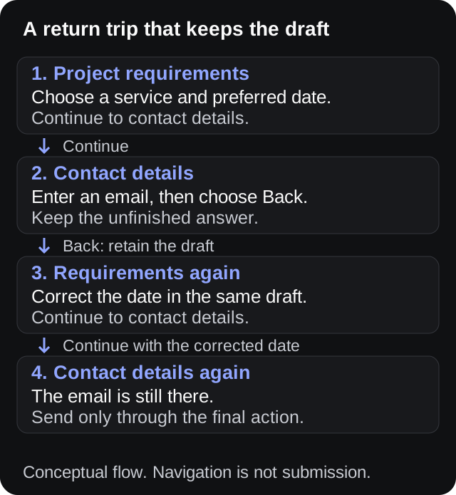
Conceptual navigation flow. No lead is submitted by moving between these steps.
Imagine a quote request with project requirements on the first screen and contact details on the second. A visitor types an email address, then remembers that the installation date on the first screen is wrong. Both the date and the email should remain available while they make that correction.
Test partial answers as well as completed steps. Enter only half of a free-text explanation, go back, and return. If the application retains only values from screens that passed validation, an unfinished answer can disappear even though a completed form seems to work.
For a custom implementation, give the form a shared answer record rather than relying only on inputs that disappear when a step is hidden or replaced. The implementation can vary; the observable requirement is that the same answer returns to the same labelled field.
Keep an explicit Start over action separate. If it clears the draft, explain that consequence before the visitor uses it. Returning one step should never quietly perform the same reset.
Let people go back before fixing the current step
A missing required email address may prevent Continue, but it should not normally prevent someone returning to the service question. They may need to correct that earlier choice before deciding which contact details to provide.
In a custom HTML form, inspect the Back control's button type. MDN documents that type="button" has no default submission behavior; a submit button can trigger the form's submission and validation path. Your handler must still implement the intended navigation.
Do not assume changing the label from Submit to Back changes the behavior. Test with an empty required field, an invalid value and an incomplete optional answer. In each case, verify both the destination and the retained text.
When a visitor does choose Continue, show the relevant correction beside the field or in a useful error summary. The lead form error-message guide covers that copy; repeating the same error on every previous screen usually does not help someone resolve it.
Recheck answers that depend on an earlier choice
Changing a service can make later answers irrelevant. A request for installation may ask about the property, while a request for a remote consultation may not. Keeping every old answer in the final payload could leave the receiving team with contradictory instructions.
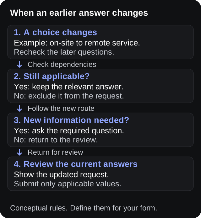
Conceptual dependency check. Adapt the rules to the questions in your own form.
Describe the dependencies in plain language before implementing them. For example: “Property access details apply only to an on-site installation.” When the service changes, evaluate that rule again and remove obsolete answers from the outgoing request.
You can retain a temporary branch draft to help someone switch back, but do not submit hidden, irrelevant values merely because they still exist in memory. Decide what happens when the visitor returns to the original branch, and test that behavior explicitly.
If a change requires new information, show those questions before allowing final submission. A short message such as “Your new service choice needs a preferred appointment day” explains the detour. Avoid clearing unrelated contact details as part of the same change.
Offer a short review when corrections matter
A review step can help when the request combines several choices that the receiving team will act on. Show useful labels and answers, with a nearby Change action for each editable group. Make an unanswered optional field understandable instead of displaying an unexplained blank.
The GOV.UK check-answers pattern describes taking people from a summary to the relevant answer, retaining their entries and returning them to the summary. If a change creates a new dependent question, collect that answer along the way.
For a compact enquiry, a full review screen may add unnecessary work. You could instead keep the earlier steps reachable and show a brief summary above the final action. Choose based on what someone needs to check, not a fixed number of screens.
For the quote example, useful review content could include service, preferred date and contact method. Avoid claiming that a preferred date is a confirmed booking. The callback request template explains how to keep that distinction clear.
Test browser Back as a different route
The Back control inside a popup can switch a form step without creating a browser-history entry. The browser's own Back button may therefore return to the previous webpage. Inspect the behavior of your actual published flow instead of assuming both controls do the same thing.
If your implementation gives each step a history entry, check browser Back and Forward through the complete sequence. A restored screen should agree with the current answers and review summary. Avoid creating extra entries merely because a visitor edited a field.
If browser Back leaves the page, test returning to the form from that page. Record whether the draft is restored and which step appears. Do not promise recovery across navigation unless you have implemented and verified it.
Also test the back gesture on the phones your audience uses. Keep the exit behavior predictable, and do not intercept a browser navigation gesture to display a promotional popup. Provide a visible in-form Back action even when history navigation also works.
Make the changed step understandable without a mouse
After a step changes, a keyboard user needs a sensible focus position and a clear indication of where they are. Check that focus has not stayed on a hidden control or jumped to unrelated content behind the popup.
W3C's multi-page forms tutorial recommends communicating progress through a sequence. Use meaningful step names where they help: “Contact details, step 2 of 3” says more than an unexplained row of dots.
Keep the Back control in a consistent place within the form layout. Verify that keyboard users can reach it, activate it and continue editing the restored fields. A visible focus indicator should remain easy to locate against your chosen colors.
Repeat the check with the mobile keyboard open. Confirm that the heading, error text and navigation remain reachable by scrolling, without horizontal page movement. A screenshot taken before the keyboard opens cannot establish that the active editing state is usable.
Separate a draft from an accepted enquiry
A visitor moving backward has not submitted another lead. In your own reporting, distinguish navigation from the final request and the receiving system's acceptance. Otherwise, a person revisiting three steps could appear to be several conversions.
Use a controlled test destination to check what arrives after an edit. Submit a clearly labelled sample, compare the received values with the final review, and verify that a removed branch has not left unwanted fields behind.
If submission fails, preserve the answers needed to retry and explain what happened. If the request succeeds, show an accurate confirmation and avoid sending it again merely because someone returns through browser history. These are release checks, not evidence that duplicate protection already exists.
The GA4 lead tracking guide explains how to separate attempts from accepted submissions. Keep personal answers out of analytics parameters; a step identifier and the action taken are usually enough to investigate navigation problems.
Run a repeatable test before publishing
Use invented sample details and a receiver your team controls. Write the expected result next to each test, then record what happened in the published form. Start with these cases:
- Complete two steps, go Back, and return without editing. Compare every field with the original sample.
- Change an earlier answer, then proceed. Confirm that the review and received request contain the new value.
- Leave a required field empty and go Back. Verify that navigation works and unfinished text survives.
- Change a branching answer. Check which later fields remain relevant and which are excluded from submission.
- Use browser Back and Forward. Record the destination, visible step and restored answers independently of the form controls.
- Test a failed final submission and a successful one. Confirm that retry retains the draft and success produces the expected record.
Repeat the relevant paths on desktop and a phone. A short screen recording with sample data can help a developer reproduce the failure. Note the exact step and control used, since “Back deleted everything” leaves several possible routes to investigate.
Apply the checklist to your PopupForge form
Open your configured form in the creator, then test its published version on the page where visitors will use it. An editor preview alone does not verify navigation, persistence or delivery on that page.
Keep the test focused on the fields and steps you actually configured. Branching, a review screen and recovery after a reload are requirements to verify if your flow needs them; this guide does not claim every builder or template provides them automatically.
Use the lead capture examples to simplify unnecessary questions before adding more navigation. Once the return trip preserves the right answers, send one labelled test through the complete delivery route and have the receiving person confirm the result.
Sources
- W3C: Let Users Go Back, supplemental cognitive-accessibility guidance.
- W3C: Multi-page Forms, progress and navigation guidance.
- GOV.UK Design System: Check answers, review and correction patterns.
- MDN: The button element, button types and default behavior.
Sources checked on 9 November 2026. Diagrams and sample workflows are conceptual examples, not customer results or a compliance certification.
Reference
Terms in this guide
FAQ
Frequently asked questions
Should Back validate the current step?
Usually, visitors should be able to return to an earlier step even when the current one is incomplete. Validate the relevant information when they continue or submit, while preserving unfinished answers during navigation.
Does keeping answers between steps mean they survive a reload?
No. Moving between steps, reloading the page and returning in another session are different persistence requirements. Test each behavior you promise and explain any expiry or reset behavior. Avoid storing personal answers indefinitely just to support a short return trip.
Put the guide into practice
See three popup directions for your website.
Paste your URL and get three brand-matched popup concepts to review. It is free to try and does not require an account.
Generate 3 popup ideas free