
The short version
- 01Check the focused field, feedback and next action with the keyboard open.
- 02Give the popup a predictable scroll path and preserve a working close control.
- 03Use narrow previews for layout, then test software keyboards on supported phones.
When a phone's keyboard covers a popup form, check whether the focused field and the next action can still be reached by scrolling inside the dialog. Fix the available space, scrolling and focus behavior together. Moving the Submit button upwards may leave the error message or close control hidden.
Test the installed form with the keyboard open, from the first field through confirmation. A narrow desktop preview helps check layout, but it does not prove how a phone browser handles its software keyboard. The examples here are proposed design checks, not reports of measured PopupForge results.
Reproduce the problem on the page where it happens
Start with the exact page, popup trigger and field reported by the visitor. Record the phone, operating system, browser and orientation, then note whether the issue appears immediately on focus or only after typing.
Use a staging page and sample details when possible. If the form sends real notifications, arrange a test destination before submitting. A screenshot containing a customer's email or phone number is unnecessary for explaining a layout defect.
Try a simple sequence: open the popup, select the lowest input, type a short answer, then reach the primary action without closing the keyboard. Record what moves when you swipe: the form content, the background page, both or neither.
That distinction gives the developer a useful starting point. “The submit button is hidden on mobile” leaves several possible causes; “the background scrolls while the popup's lower fields stay fixed behind the keyboard” describes a specific interaction.
Separate the visible area from the page layout
A phone has less space available when the software keyboard opens. MDN's VisualViewport documentation explains that the visual viewport can shrink without the layout viewport changing. A dialog positioned against the larger layout can therefore extend beyond what the visitor can currently see.
Do not assume that every browser responds identically. Record the actual device behavior before choosing a CSS or JavaScript adjustment, especially if the form works in one browser and fails in another.
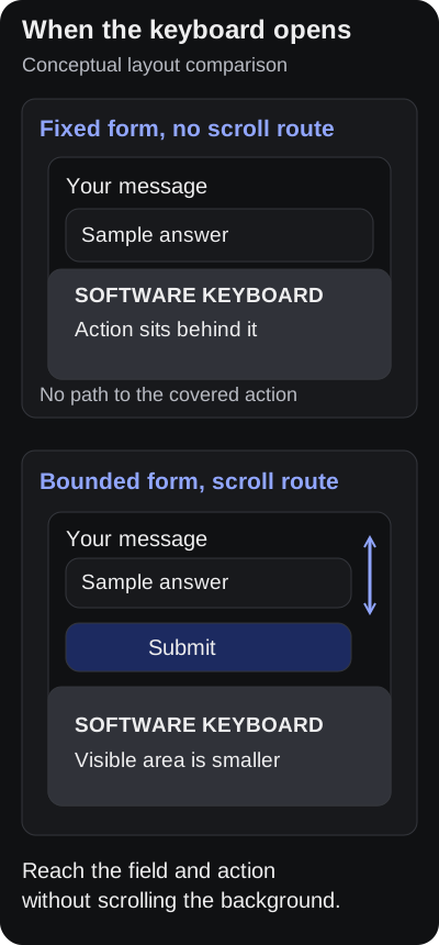
Conceptual layout comparison. The keyboard and form sizes are illustrative, not measurements from a particular phone.
Ask which element controls the popup's height and which element owns scrolling. A fixed outer panel, a clipped inner wrapper and a fixed button can each look reasonable separately while leaving no usable scroll path together.
The acceptance condition is practical: a visitor can read the active label, edit the answer, find feedback and reach the next action. You do not need every field visible at once, but no required control should become unreachable.
Give the form one predictable scroll path
Keep the popup within the available screen area and allow its necessary content to scroll. Avoid a chain of nested containers that each capture a different part of the gesture.
For example, consider a callback form with a service choice, contact details and a message. If the message field opens the keyboard near the bottom, the visitor needs a clear way to move between that field and the submit action without dragging the page behind the dialog.
Test the top and bottom of the form, not just the middle. A layout can allow scrolling down to Submit while leaving the title and close control impossible to recover after the keyboard opens.
A persistent action area may be useful, but it needs enough space around the scrollable content. Check that the last field, its help text and its validation message can move fully above that area rather than disappearing underneath it.
If a sticky footer creates the obstruction, consider letting it join the normal content flow on short viewports. W3C documents removing fixed positioning under constrained viewport conditions as one way to avoid hiding focused controls. Test the result with the site's own banners and navigation still present.
Keep the focused field visible after every transition
Selecting an input is only the first transition. The popup may also change height when an error appears, a new step opens or an optional question is revealed.
Repeat the visibility check after each of those changes. A field that was correctly positioned before a two-line error message may no longer have enough room once that message is inserted.
W3C's Focus Not Obscured guidance addresses focused controls being entirely hidden by author-created content. The operating system's keyboard and a website's sticky footer are different sources of obstruction; do not label every keyboard overlap as the same WCAG failure.
For your design review, aim to keep the whole relevant control and its feedback usable, even where a minimum criterion has narrower wording. A partially visible input can still be frustrating to edit.
When custom code adjusts positioning, test opening and dismissing the keyboard repeatedly. Look for a leftover blank area, a button stranded halfway up the screen or a page that remains locked after the popup closes.
Preserve a clear route through fields and steps
The keyboard layout should fit the information requested. MDN describes inputmode as a hint for an appropriate virtual keyboard, not a validation rule. Choosing a numeric layout does not establish that an answer is valid or that the layout includes every character a visitor needs.
For an email field, check typing, pasting and autofill on the target phone. The email autofill guide covers field meaning and saved-contact behavior in more detail.
Do not assume that the keyboard's action key always submits the form. Test what it does on each step and make the visible Continue or Submit control understandable on its own.
In a multi-step form, use the same sample answers while moving forward and back. Check whether changing steps preserves the answers, puts focus somewhere sensible and leaves the next question reachable above the keyboard.
If an earlier answer changes which questions apply, verify the newly displayed field and its label too. Our Back button guide covers answer preservation; this check adds the constrained screen area to that navigation test.
Test error correction before calling the layout finished
Submit an incomplete sample request on staging and inspect the resulting message. The visitor should be able to identify the problem and return to the relevant field without losing valid answers.
Use an error near the bottom of the popup, where space is tightest. Try a realistic long message, such as an explanation of an unsupported phone format, instead of testing only a short red label.
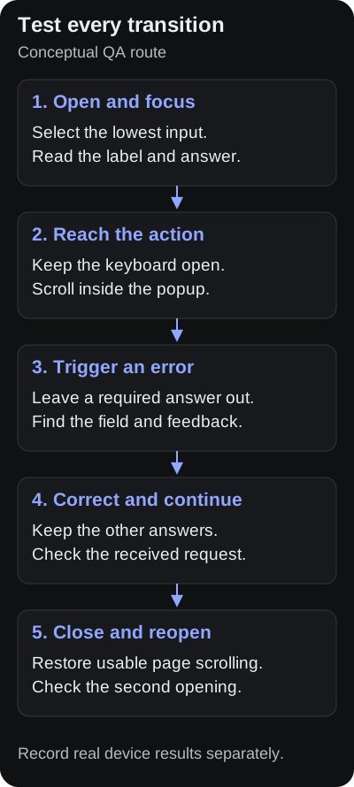
Conceptual QA route. Complete it on the installed form and record observed results separately.
Keep the error-message wording connected to the visible field. If an error summary is used, test whether following it brings the relevant control into a position where both the question and feedback can be read.
After correction, complete one authorized test request and inspect confirmation. A success message hidden behind the keyboard can leave the person unsure whether anything happened, even if the receiving service accepted the request.
Check the receiving record as a separate step. A visible confirmation alone cannot establish which answers arrived, and repeatedly pressing the action to investigate may create duplicate requests.
Make dismissal work while the keyboard is open
Keep an obvious close control available throughout the form. Verify that closing the popup restores the page to an operable state rather than leaving scrolling disabled or focus attached to an element that is no longer visible.
The WAI-ARIA modal dialog pattern describes focus moving inside the dialog, contained Tab navigation, Escape dismissal and appropriate focus restoration. Those behaviors still need testing in the implemented interface; a dialog role by itself does not create them.
Use a hardware keyboard for the Tab and Escape checks where available, and test the touch close control separately. Dismissing a phone's software keyboard and dismissing the popup are different actions, so record the result of each.
Then reopen the popup. Confirm whether your intended behavior is to retain a draft or start afresh, and make sure no old height adjustment breaks the second opening.
Build a small test record the team can repeat
Choose devices from verified audience data when you have it. Without that data, begin with the browsers and devices your product explicitly supports, and label the remaining coverage as untested.
A 390px desktop viewport is useful for checking text wrapping and diagram or form width. Real-device checks are still needed for the software keyboard, browser controls and operating-system interactions.
- Open the popup in portrait orientation and focus the first and last fields.
- Type a longer answer, paste a value and try available autofill.
- Reach Continue or Submit with the keyboard visible, then with it dismissed.
- Trigger a field error and correct it without losing other answers.
- Move forward and back through any steps, checking the newly focused field.
- Close, reopen and confirm that the background page still scrolls normally.
- Repeat the affected route in the other supported phone browser and record differences.
Keep the record short enough to use again after a change: device, browser version, starting page, action, expected behavior and observed result. Attach a screenshot with sample data and identify the first failing transition.
For PopupForge, review the installed popup on its destination page alongside the editor preview. The surrounding site's fixed headers, cookie banner and styles belong in the test; this guide does not claim that a particular template has passed your device matrix.
Use the broader popup design checklist for offer clarity and overall layout. Treat this keyboard route as one release check, with a named owner for any device or receiving-system result still unverified.
Sources
- MDN: VisualViewport, for visual versus layout viewport behavior.
- MDN: inputmode, for keyboard hints and their limits.
- W3C: Focus Not Obscured (Minimum), for author-created content obscuring focus.
- W3C technique C34, for adjusting fixed positioning under constrained conditions.
- W3C: Modal Dialog Pattern, for dialog keyboard interaction and focus handling.
Reference
Terms in this guide
FAQ
Frequently asked questions
Does a 390px browser preview test the mobile keyboard?
It checks a narrow layout, but it does not establish how a real phone browser responds to its software keyboard. Test the installed form on supported phones, including typing, error correction and dismissal, before marking that interaction as verified.
Should the Submit button always stay fixed above the keyboard?
A persistent action area is one design option, not a universal requirement. The action must remain reachable without hiding the focused field or its feedback. A form with a clear scrolling route may be simpler; test the full interaction before choosing fixed positioning.
Put the guide into practice
See three popup directions for your website.
Paste your URL and get three brand-matched popup concepts to review. It is free to try and does not require an account.
Generate 3 popup ideas free